Optimizing Navigation Visibility in Google Gemini Web


Category:
Web App Redesign
Client:
Gemini
Duration:
4 Days
Users should not experience ambiguity when interacting with an interface. In this case study, I identified and addressed a critical usability friction point within the sidebar navigation of the Google Gemini desktop web interface. Users shouldn't have to pause to recall how a system works; the action must be recognized immediately.
Approach
Rather than relying on assumptions, this redesign was driven by structured research and competitor benchmarking. By analyzing how other productivity tools like Google Maps and ChatGPT handle sidebar states, and evaluating the interface against Nielsen’s Heuristics, the core usability issues were clearly defined before any visual changes were made.
Vision and Innovation
The goal was not just to apply a quick visual fix, but to introduce a solution that seamlessly integrates with Google's Material Design (M3) principles. The vision was to innovate the interaction while maintaining consistency—preserving the visual weight and position of the original layout so the interface remains familiar to the user.
Identifying Unique Challenges
The primary challenge lay in the expanded state of the sidebar: the toggle icon remained a static Hamburger Menu. This created ambiguity, forcing users to question whether clicking the icon again would "Refresh" the menu or "Close" it.
Resolving Complex Problems
I explored multiple design solutions to resolve this friction:
Option A: Moving the toggle to the top-right. This was rejected because it increased the "Interaction Cost" (Fitts's Law), forcing the user to move their mouse across the screen to close the panel they just opened.
Option B: Using a standard back arrow. This was rejected because, in a browser environment, it could easily be confused with the browser's default "History Back" action.
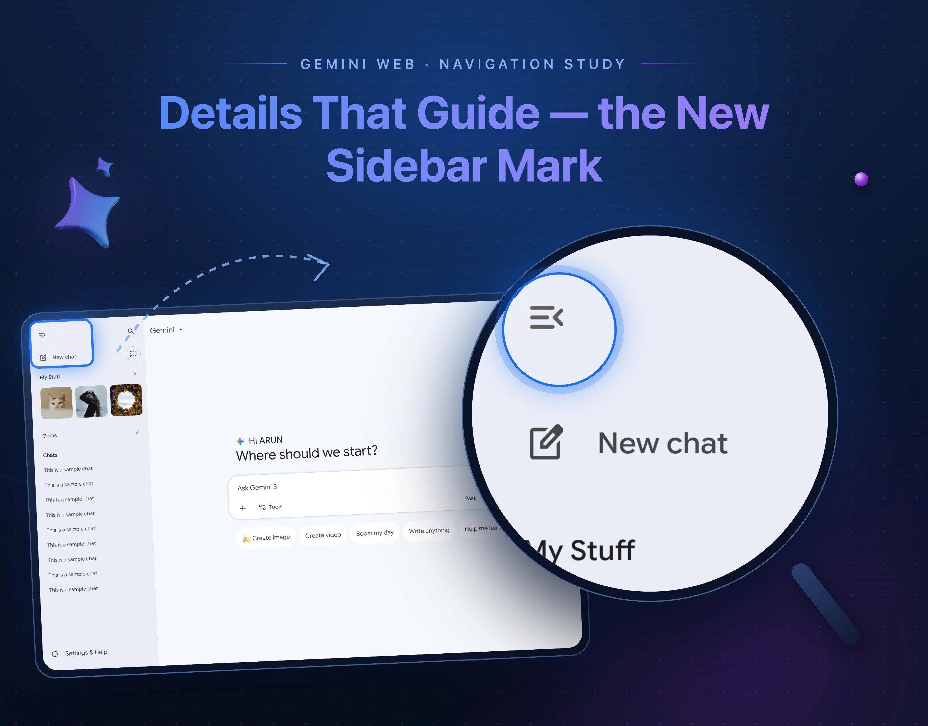
Final Solution: I selected a hybrid 'Menu Open' icon that intelligently integrates a directional left-chevron.
User-Centric Design
Every decision was focused on reducing cognitive load. The original design violated the "Visibility of System Status" heuristic, causing momentary user hesitation as the exit path wasn't visually distinct. By applying the "Recognition rather than Recall" principle, the new design visually communicates the "Collapse" action so users don't have to think twice.
Meeting User Needs
The design directly answers the user's subconscious questions. In the "Before" state, the static icon prompted the thought: "Is this a menu? Will it refresh?", resulting in hesitation. The "After" state provides immediate clarity: "Ah, this arrow points left. Clicking this hides the menu", resulting in instant recognition and action.
Detailed Pages and Features
To execute this, I replaced the static hamburger icon in the expanded menu with the 'Menu Open' variant. The integrated left-chevron (<) clearly indicates the direction of movement (Collapse to left). This smartly retains the context of a "Menu" while adding an unmistakable "Collapse" signifier.
Accessibility and Optimization
This redesign is highly optimized for the existing layout. It maintains the visual weight and position of the original menu icon, completely preventing any jarring layout shifts. Furthermore, it strictly complies with Material 3 guidelines for state-based iconography, ensuring the icon perfectly reflects the current active state of the UI.
Conclusions
Ultimately, the redesign transforms a moment of user hesitation into instant recognition and action. By replacing an ambiguous static icon with a state-aware directional cue, the usability friction was entirely eliminated, significantly improving the overall clarity and experience of the interface.


